Baby Bliss
Playful, soft and full of personality
A logo and moodboard exploration built around tone and feeling, using color, form and typography to shape a brand that feels warm, light and distinctly its own.
Finding the feel
This project focused on exploring different moods for the brand through logo concepts and supporting moodboards. Each direction leans into a different tone, from soft and playful to calm and minimal, using color, typography and form to shape how the brand feels at first glance.

“Branding is how something feels before it’s ever explained.”
Set The Tone
Each direction starts with a feeling, using color, reference and style to define the mood before anything is finalized.
Explore The Look
Logo concepts and moodboards are developed together, shaping how the brand feels through form, color and type.
Refine The Direction
The strongest concepts are adjusted and simplified until the tone feels clear, cohesive and intentional.
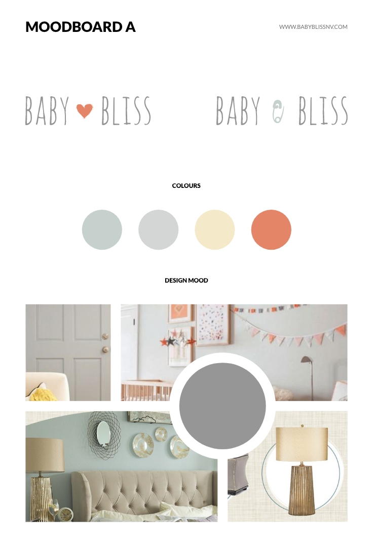
Moodboard A
Soft, warm and playful with light tones and gentle contrast, leaning into comfort and a friendly, approachable feel.
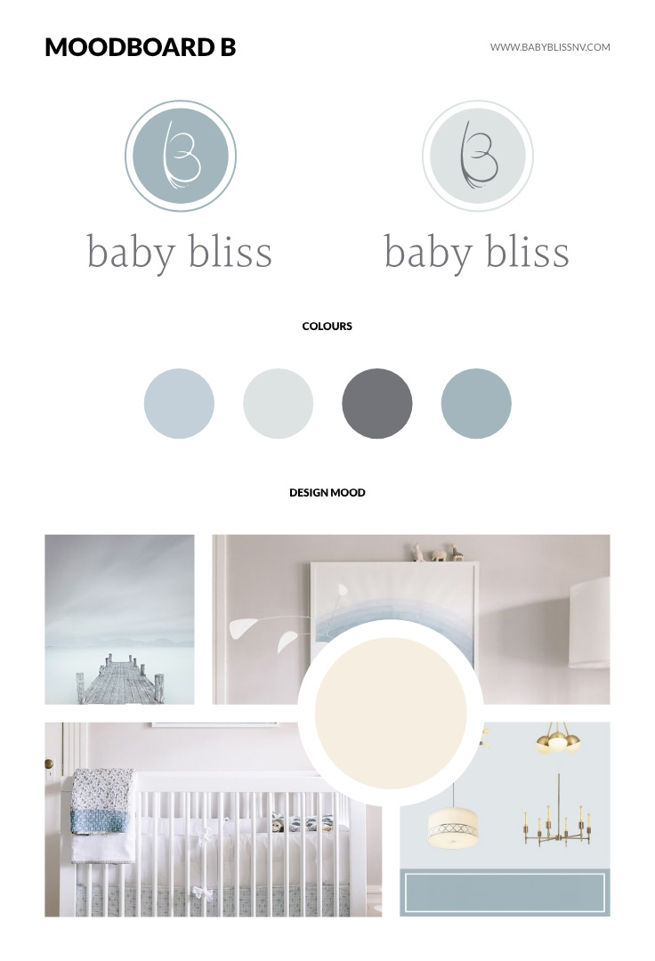
Moodboard B
Cooler and more minimal with a calm palette and cleaner typography, giving the brand a more modern, understated tone.
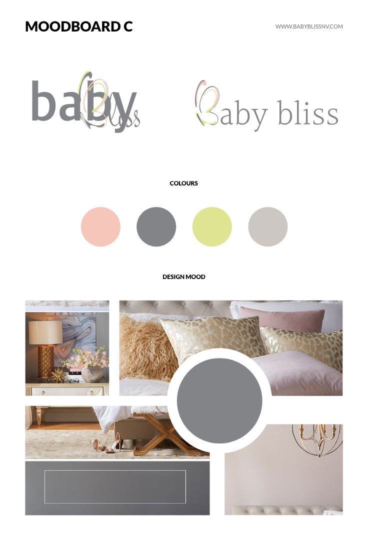
Moodboard C
A brighter, more expressive direction with stronger color contrast and a slightly bolder, more energetic feel.
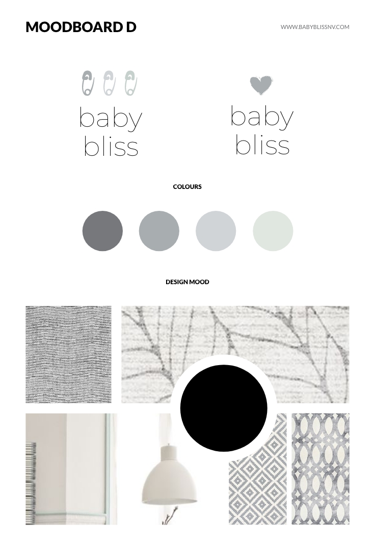
Moodboard D
Neutral and pared back, focused on simplicity, balance and a quiet, refined aesthetic.