Kohala Pop-Up
Bold, bright and built to stand out
A set of design pieces created for a one-time pop-up restaurant, carried across print and digital.
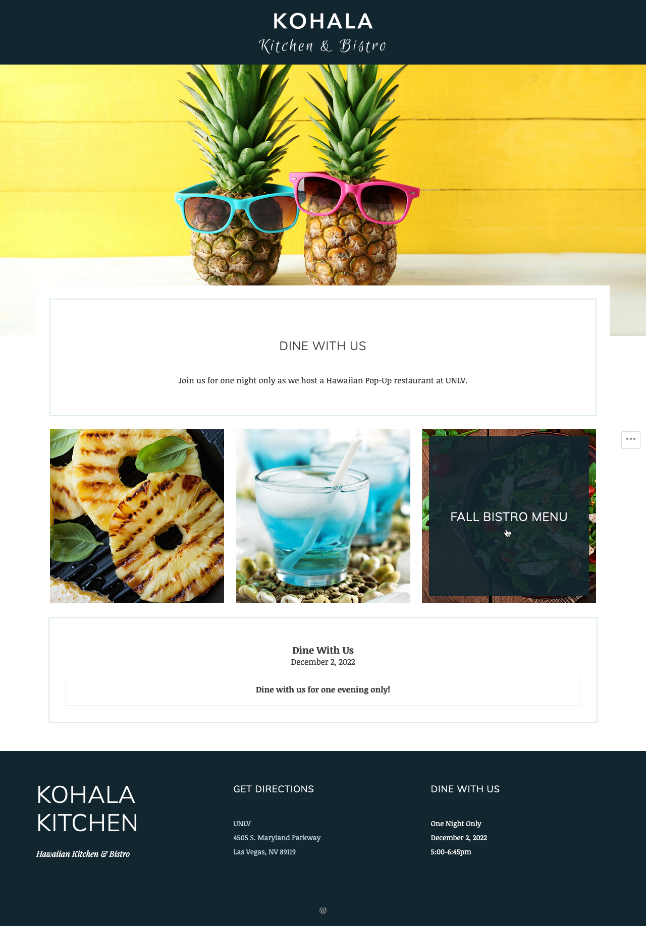
A unified design
A consistent visual direction applied across flyer, menu, tickets and a landing page, using color, type and imagery to keep everything aligned.


“Bright, fun and made to catch attention fast.”
Set the look
A bold color palette and simple type establish the visual direction upfront.
Lay it out
Flyer, menu, tickets and the site are each built to fit their format, keeping hierarchy clear and spacing tight.
Keep it clear, direct
Everything is designed to read fast, with simple structure and no extra layers getting in the way.
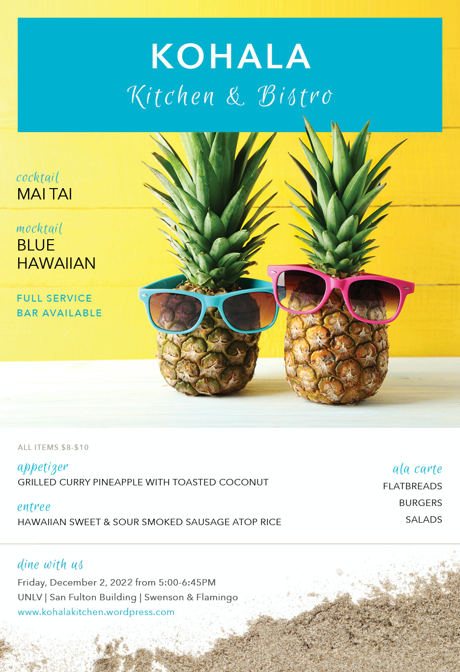
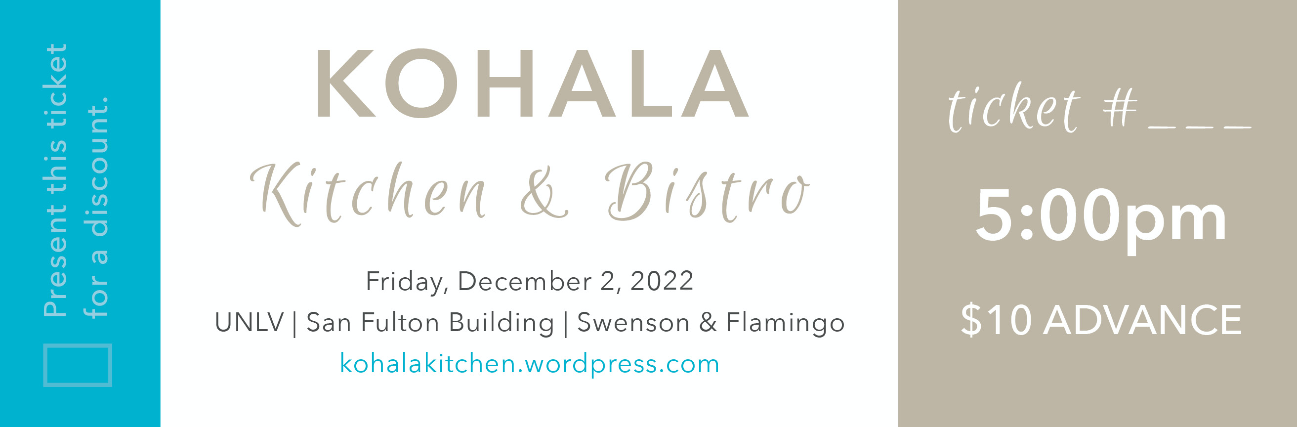
Flyer & tickets
Primary pieces used to promote the event and manage entry, designed with bold color and clear hierarchy so everything is easy to read and recognize.
Menu
Clean structure with strong hierarchy so items are easy to scan and order from.


