UX & Design

Campaign & Content

Brinker Co.
Results worth sharing.

A client success campaign system to present business intelligence clearly and consistently.

Client results — structured output
17%
736
+55%
+112%
Content framework
01
02
03

Brinker Co had compelling client results but no consistent way to present them. Materials were fragmented, format-dependent, and hard to act on — insights that should have been driving decisions were getting lost in inconsistent presentations.

The work built a content system from the ground up: a structured framework for turning business results into clear, navigable stories, delivered across both a web landing experience and a downloadable print PDF — same structure, same story, two formats.

  • End-to-end campaign system across web and print

  • Standardized content framework for repeatable case study production

  • Guided experience — context, solution, results in a clear sequence

  • Data visualization approach making complex insights digestible

  • Web and print outputs aligned to the same system

1 system

One content framework powering both web and print outputs

2 formats

Web landing experience + downloadable PDF — same structure, both usable

Scalable

Repeatable template structure — built to produce more case studies without starting from scratch

Clarity ↑

Fragmented materials replaced with a guided, structured narrative format

The Challenge

Good results,
no system to show them.
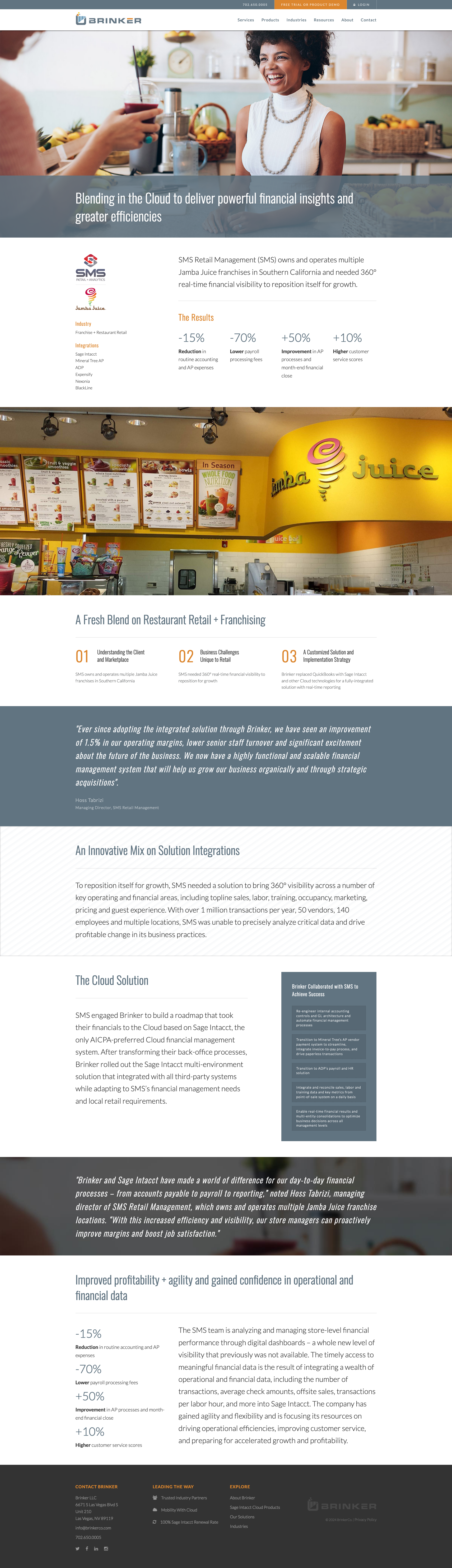
The problem wasn’t the results — it was how they were being presented. Every client story lived in a different format, told at a different depth, with no consistent framework for what to include or how to sequence it. Insights that should have been driving decisions were getting buried in inconsistency.

The brief was to fix that — not just design one page, but build the system that makes every future case study faster to produce and clearer to read.

Key problem areas

Fragmented formats

Each client story presented differently — different structure, different depth, no repeatable framework.

Data without context

Business intelligence results were being presented without the context, solution narrative, or visual support needed to make them land.

Web and print misaligned

Digital and print materials told the same story differently — no shared structure, inconsistent depth, different visual language.

Content system

One framework, two formats

The content system defines what goes into every case study and in what order — regardless of whether it ends up on a web page or a printed PDF. The same four stages map to both outputs, creating consistency across formats without sacrificing the strengths of each medium.

figma — BrinkerCo-content-system-v2 — framework & format mapping
Web experience
Print / PDF
01 Context
Web
Hero + challenge statement
Full-bleed header with client, challenge summary and scope
PDF
Cover + brief overview
Branded cover with client and engagement summary
02 Solution
Web
Guided experience sections
Scrollable sections — content system, approach, data & visualization
PDF
Solution narrative pages
Same three sections, page-based layout with visual hierarchy
03 Results
Web
Data visualization + key metrics
Charts, stats, callouts — designed for screen scanning
PDF
Structured results spreads
Same metrics, print-optimized for sharing and presentation
04 Action
Web
CTA + PDF download
Connect, download the full report, or explore more
PDF
Contact + next steps
Branded back page with contact and engagement invitation
Why this matters: The next case study starts from a template, not a blank page. Every stakeholder already knows where to find the context, solution, and results — regardless of whether they’re reading on screen or holding a PDF.

The Live Product

Laptop Device
Brinker-Case-Study-SMS-Retail-Management-Jamba-Juice-Digital

Guided experience

Sequencing information for comprehension

The order information is presented matters as much as the information itself. The guided experience was designed to move a reader from zero context to clear understanding in five deliberate steps — each stage earning the next, and no step asking the reader to hold more than they need to.

figma — BrinkerCo-guided-experience — information sequence
01
Who & what
Client, industry, scope
02
The problem
Challenge, business context
03
The approach
Solution, methodology
04
The results
Data, metrics, outcomes
05
What’s next
Action, download, connect
Step 01
Context first
Reader needs to know who the client is before any problem or solution lands. Skipping this creates comprehension gaps later.
Step 02
Make it specific
Vague challenge statements don’t create investment. The problem needs to be concrete enough that the solution feels necessary.
Step 03
Show the thinking
The approach connects problem to results. Without it, results feel like luck rather than the product of clear methodology.
Step 04
Headline first
Results presented with visual hierarchy — most important number first, supporting data beneath. Designed for scanning, not just reading.
Step 05
One clear action
Every case study ends with one ask. Download the PDF, reach out, or explore more. Clear, not cluttered.

Design Thinking

Decisions that shaped the system

01

System first, execution second

Before designing a single screen, the content framework was defined — what stages every case study must include, what each stage contains, and how it maps to both formats. Execution without a system produces one good thing. A system produces many.

02

Web & print as outputs, not separate projects

Designing web and PDF as two expressions of the same system — rather than two separate briefs — meant the content only needed to be structured once. Both formats inherit the same logic, hierarchy, and narrative.

03

Sequence earns comprehension

Information architecture wasn’t just about organizing content — it was about sequencing it so each step creates the context needed to understand the next. Context before problem. Problem before solution. Solution before results.

04

Data needs design to land

Business intelligence results don’t speak for themselves — they need visual hierarchy, context, and the right level of detail. The data visualization approach was designed to make the headline number land first, with supporting evidence beneath it.

outcomes

What it delivered

A repeatable system

Every future case study starts from a template, not a blank page — same structure, same sequence, same quality standard without rebuilding from scratch.

Web and print aligned

Both formats tell the same story with the same structure — no inconsistency between what a client sees online and what they hold in their hand.

Clarity at every step

Fragmented materials replaced with a guided narrative — context, solution, results, action — that any stakeholder can follow without prior knowledge of the engagement.

WordPress

Figma

UX Strategy

Information Architecture

Content Systems

Data Visualization

Print Design

UI Design