UX & Design

Luxury eCommerce

Aisle rocket Studios

JennAir.
Luxury, navigated.

Focused UX work across the JennAir platform — restructuring how users navigate, configure, and discover luxury appliances, alongside building the brand’s first lifestyle-led editorial campaign experience.

Nav → PDP

Reduced from 2–3 clicks to one —
icon strip wayfinding restructure

Drop-off ↓

Live pricing + persistent drawer addressed primary configurator abandonment causes

1st

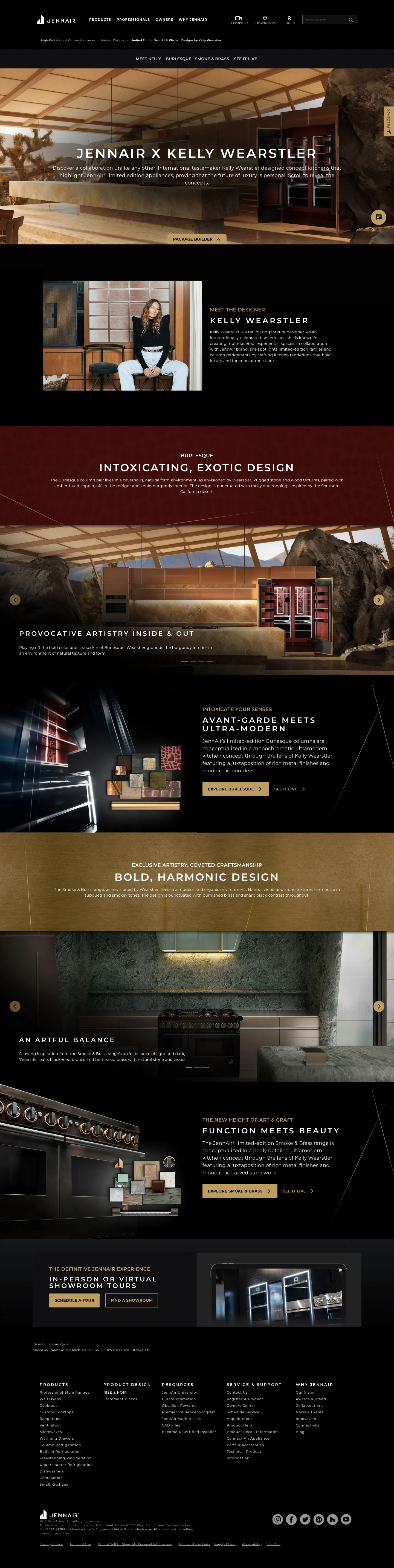
Lifestyle-led editorial page on site — set the template for all influencer campaigns

3

Major surface areas redesigned: navigation, configurator, campaign pages

The Challenge

A luxury brand with an
un-luxury experience.

JennAir’s products demanded restraint and editorial confidence. The site delivered neither. Product categories were buried inside promotional clutter, the navigation didn’t reflect how buyers of high-end appliances actually shop, and the configurator — a critical conversion tool — created friction instead of confidence. The work was about removing noise, clarifying structure, and building experiences that matched what the brand stood for — without sacrificing the conversion pathways the business depended on.

“Luxury demands restraint. The work was about removing noise, clarifying structure, and letting the product speak for itself.”

Key problem areas

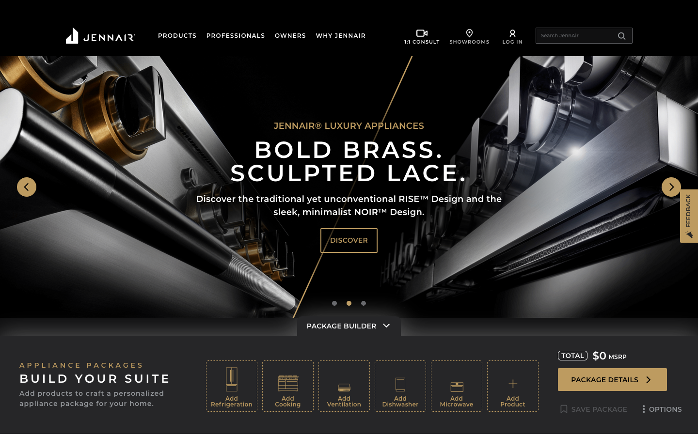
Navigation & Wayfinding

No clear product hierarchy. Promotional content competed with core navigation, forcing users to hunt for product categories.

Configurator Drop-off

The package builder and Curate tool created anxiety rather than confidence — unclear slot structure, buried pricing, no visible progress.

Brand storytelling gap

Designer collaboration campaigns had no dedicated editorial framework. Lifestyle photography wasn’t being used to its potential.

Information architecture

Restructuring the product hierarchy

The nav wasn’t organized around how people shop for luxury appliances — it was organized around how the business thought about its products. We restructured it around product type first, with clear wayfinding that let buyers orient themselves immediately.

figma — JennAir-IA-restructure-v3 — navigation before / after
Before — cluttered, promotion-first
Primary Navigation
Products buried
Promotions top-level
Professionals
Owners
Why JennAir unclear
CURATE hidden
Inspiration
Brochures
Where to Buy
Get Started 9th item
After — product-first, clear wayfinding
Primary Navigation
Products elevated
Professionals
Owners
Why JennAir
Shop by Product strip new
9 icon-based categories
Refrigeration · Ranges · Wall Ovens…
CURATE surfaced
Designer Collabs new
Key decision: Moved product categories out of the nav dropdown and into a persistent icon strip below the hero — visible on every page load without requiring interaction. The “Shop by Product” pattern reduced cognitive load of the top nav while giving product types permanent real estate above the fold.

Wayfinding design

Icon-based product navigation

The “Shop by Product” strip became the primary wayfinding system — a persistent row of product category icons that gave users immediate orientation without hunting through a dropdown. Each icon was designed in JennAir’s premium line-art style to feel native to the brand.

figma — JennAir-wayfinding-icons — shop-by-product strip
SHOP BY PRODUCT
Refriger­ation
Ranges
Wall Ovens
Cooktops
Rangetops
Ventil­ation
Small Kitchens
Under­counter
Dish­washers
Design rationale: Icons use JennAir’s premium line-art visual language — thin stroke, architectural precision. Each is immediately recognizable as its product category. Active state uses brand gold (#C9A96E) to match the luxury palette. Highlighted icon shows the selected/hovered state.
UX decision: The strip sits below every hero, visible on first viewport on most screens. Users no longer need to open the Products dropdown to orient — scan and click in one step. This was the single highest-impact navigation change in the engagement, reducing product category wayfinding from 2–3 clicks to one.

Configurator UX

The Package Builder & Curate experience

The Curate promotion and Package Builder were core revenue tools — but the UX created friction at exactly the moment users needed confidence. We redesigned the slot-based configurator to make progress visible, pricing transparent, and the path to completion obvious.

figma — JennAir-package-builder-annotations-v4
PACKAGE BUILDER
A
APPLIANCE PACKAGES · BUILD YOUR SUITE
Add Refrig­eration
Add Cooking
Add Ventil­ation
Add Dish­washer
Add Micro­wave
Add Product
B
TOTAL
$0 MSRP
PACKAGE DETAILS ›
SAVE PACKAGE
C
Design notes
A
Persistent drawer trigger
Package Builder anchors to the bottom of the hero — always accessible without scrolling. Eliminates the “where do I start” friction that drove early abandonment.
B
Icon-based slot system
6 appliance slots using the same icon language as the homepage nav strip. Dashed = empty, solid = filled. Consistent visual language reduces relearning across surfaces.
C
Live running total
MSRP updates as each slot fills. Previously hidden until “Package Details” — the primary source of price-shock abandonment. Surfacing it live builds confidence throughout, not just at the end.

Final Product

Campaign UX — Designer collabs

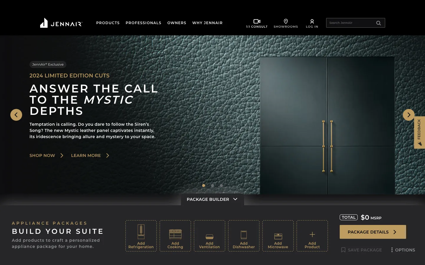
The first lifestyle-led editorial experience

The Curate promotion and Package Builder were core revenue tools — but the UX created friction at exactly the moment users needed confidence. We redesigned the slot-based configurator to make progress visible, pricing transparent, and the path to completion obvious.

figma — JennAir-collab-page-structure — editorial-commerce hybrid
Meet Kelly
Burlesque
Smoke & Brass
See It Live
A
B
Build Your Suite
C
D
Concept: Burlesque
E
Concept: Smoke & Brass
F
Design notes
A
Sticky section nav
Persists on scroll. Anchors to each concept section — users can jump directly to the designer story they want without losing context.
B
Lifestyle hero
Designed kitchen space leads — no isolated product on white. Brand through environment. First on JennAir site
C
Inline commerce
Package builder embedded within editorial context. Commerce doesn’t interrupt the story — it lives alongside it.
D
Designer first
Bio and portrait before any product reveal. Luxury positioning through association with the designer’s creative world.
E
Concept sections
Each concept has its own full-bleed moment. Alternating layout keeps the scroll experience dynamic. New pattern
F
Experiential CTA
Showroom tour — not “buy now.” Conversion path matched to how luxury buyers actually purchase high-end appliances.
Why this mattered: First time JennAir led with a designer’s creative vision before showing product. Commerce embedded inside content — not the other way around. This page architecture became the template for every subsequent influencer and brand collaboration on the site.

Final Product

Design Thinking

Decisions that shaped the work

01

Product categories above promotions

Luxury shoppers don’t respond to promotional clutter — it cheapens the brand. We moved product navigation to the persistent icon strip and pushed Curate/promotions to secondary visibility. Wayfinding clarity first, offer discovery second.

02

Consistent icon language across surfaces

The same icon set used in “Shop by Product” was carried into the Package Builder slot system. A user who learns the icons on the homepage arrives at the configurator already fluent — no relearning, less friction.

03

Show the running total, always

The old configurator hid the MSRP until “Package Details” — creating price anxiety at the worst possible moment. Moving the live total into the builder itself made pricing a confidence signal, not a reveal.

04

Lifestyle photography leads, product follows

The Kelly Wearstler collaboration pages were the first on the site to lead with designer lifestyle imagery rather than isolated product shots. This matched how luxury consumers actually relate to high-end appliances — through the spaces they enable, not technical specifications.

Outcomes

What it delivered

Improved product discoverability

Icon-based “Shop by Product” strip reduced the navigation steps to reach a product category from 2–3 clicks to a single tap — measurably faster paths to PDP.

Reduced configurator abandonment

Live pricing visibility and the persistent drawer pattern addressed the two primary sources of Package Builder drop-off — hidden cost anxiety and “where do I start” confusion.

New editorial template established

The Kelly Wearstler collaboration page was the first lifestyle-led editorial page on JennAir’s site — and became the template for all subsequent designer partnership campaigns.

Figma

AEM (Adobe Experience Manager)

Monday.com

DAM

InDesign

UX Strategy

Information Architecture

UI Design

Mobile Optimization