UX & Design

ecommerce

Codal

glassybaby.

The site wasn’t doing the product justice.

glassybaby makes handcrafted glass votives with deep emotional resonance — gifting, ritual, memory. The site wasn’t reflecting any of that. Navigation was flat, browsing lacked structure, and the flow from discovery to purchase added friction where it should have added confidence.

View Live Site

Nav → PDP

Reduced path from landing to product — fewer steps, cleaner structure

Filters ↑

Introduced filtering where none existed — improved product findability

Expanded

UX improvements validated and rolled out across additional site areas

Brand ↑

In-context photography and editorial moments introduced for the first time

The Challenge

The experience didn’t
match the brand.

glassybaby’s products carry real emotional weight — gifting, ritual, memory. The site didn’t reflect any of that.

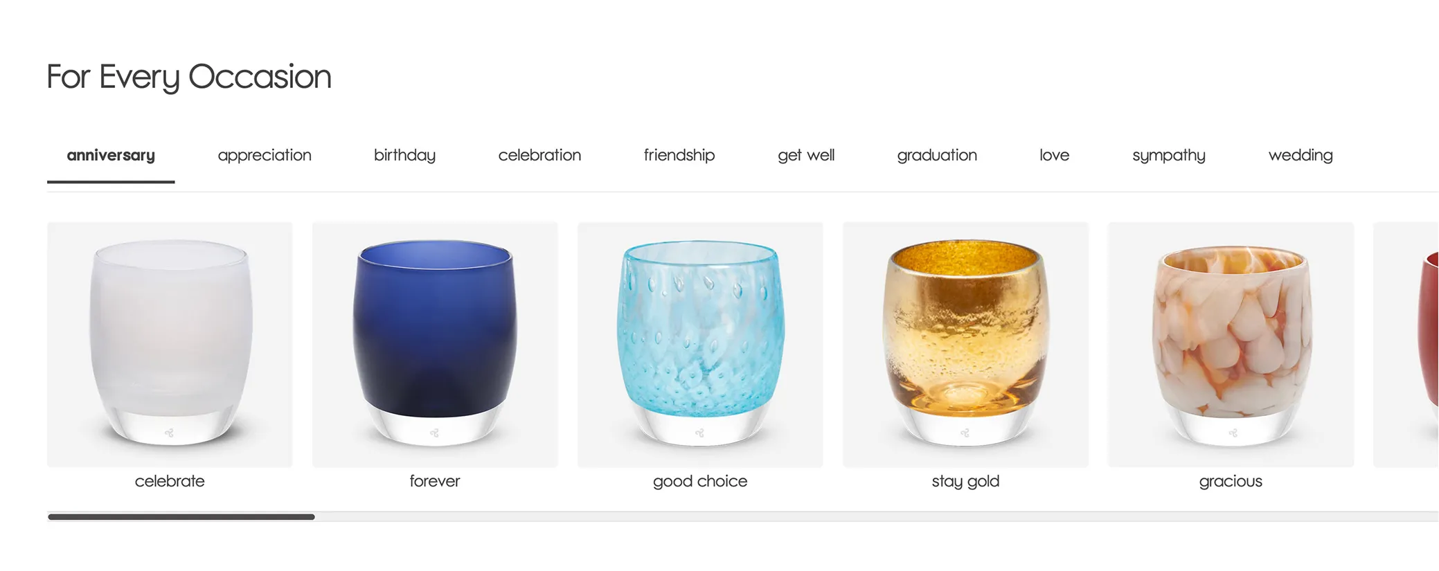
Navigation without structure

A flat nav with no clear hierarchy. Users couldn’t tell where to start, and the categories didn’t reflect how people actually shop for gifts or occasions.

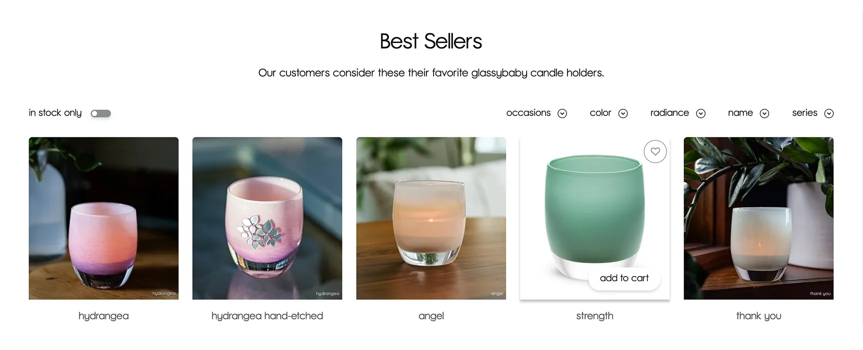
No way to filter or sort

Product grids with no filtering meant users scrolling through everything to find what they were looking for. For a catalog of handcrafted items, that’s a conversion killer.

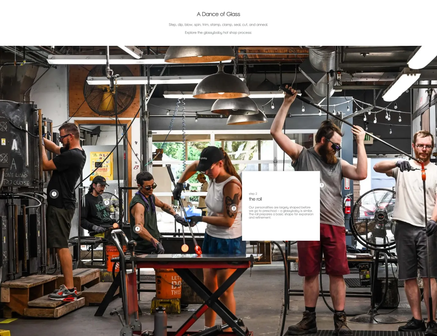
Photography not doing its job

Products shown in isolation — not in the context of the moments they’re meant for. The emotional story wasn’t being told anywhere in the browse or discovery experience.

Flow didn’t build confidence

Trust signals, engagement moments, and the path from discovery to purchase were all underdeveloped. Users arrived interested and left without converting.

Information architecture

Restructuring navigation around how people shop.

Nav Before

Nav after

Before — hamburger only, no visible nav
Shopping by color
Homepage
Open hamburger
Hunt for entry point
No visible nav — color, glassybaby’s primary browse dimension, had no direct path
Browsing collections
Homepage
Open hamburger
Collections buried
Required interaction before any navigation was visible at all
Finding events / experiences
Homepage
No visible path
Events not surfaced — a revenue stream with no navigation entry
Returning to browse
Any page
Open hamburger again
Every navigation action required the same hidden menu — no persistent wayfinding
After — persistent nav: Products · Colors · Collections · Events · About
Shopping by color
Any page
Colors — top-level
Filtered results
Color elevated to first-class nav item — matches how shoppers actually browse
Browsing collections
Any page
Collections — visible
Collection browse
One click from anywhere on the site — no hunting required
Finding events / experiences
Any page
Events — top-level
Events surfaced as a primary destination — revenue stream now has a clear path in
Returning to browse
Any page
Persistent nav always visible
No interaction required — wayfinding available at every point in the journey

Product browsing UX

Filtered, interactive browsing.

The product grid had no filtering, lifestyle photography was static, and there was no engagement built into the shopping experience. Now it’s one connected system — filter by color or occasion, explore the craft through interactive hotspots and engage without leaving the page.

All
Black
Blue
Blush
Clear
Green
A
B
C
D
E
Design notes
A
Filter & sort
Color, occasion, collection, price — the four dimensions shoppers actually use to decide.
B
Product grid
Color swatch visible on card for browsing by color without opening the PDP.
C
Interactive hotspots
Lifestyle imagery becomes explorable — inviting people into the craft story.
D
Email capture
Engagement moment embedded directly in the browse experience.
E
Trust signals
Shipping, payments, and service surfaced on product pages — not just at checkout.

filters, improved product listing, in-context photography, quick actions

streamlined cross-promoting between categories

on-page engagements and trust signals

Hotspot Exploration – process and craft behind the product

Figma

Shopify

UX Strategy

Information Architecture

UI Design

Product Discovery

Conversion Optimization

Mobile Optimization